

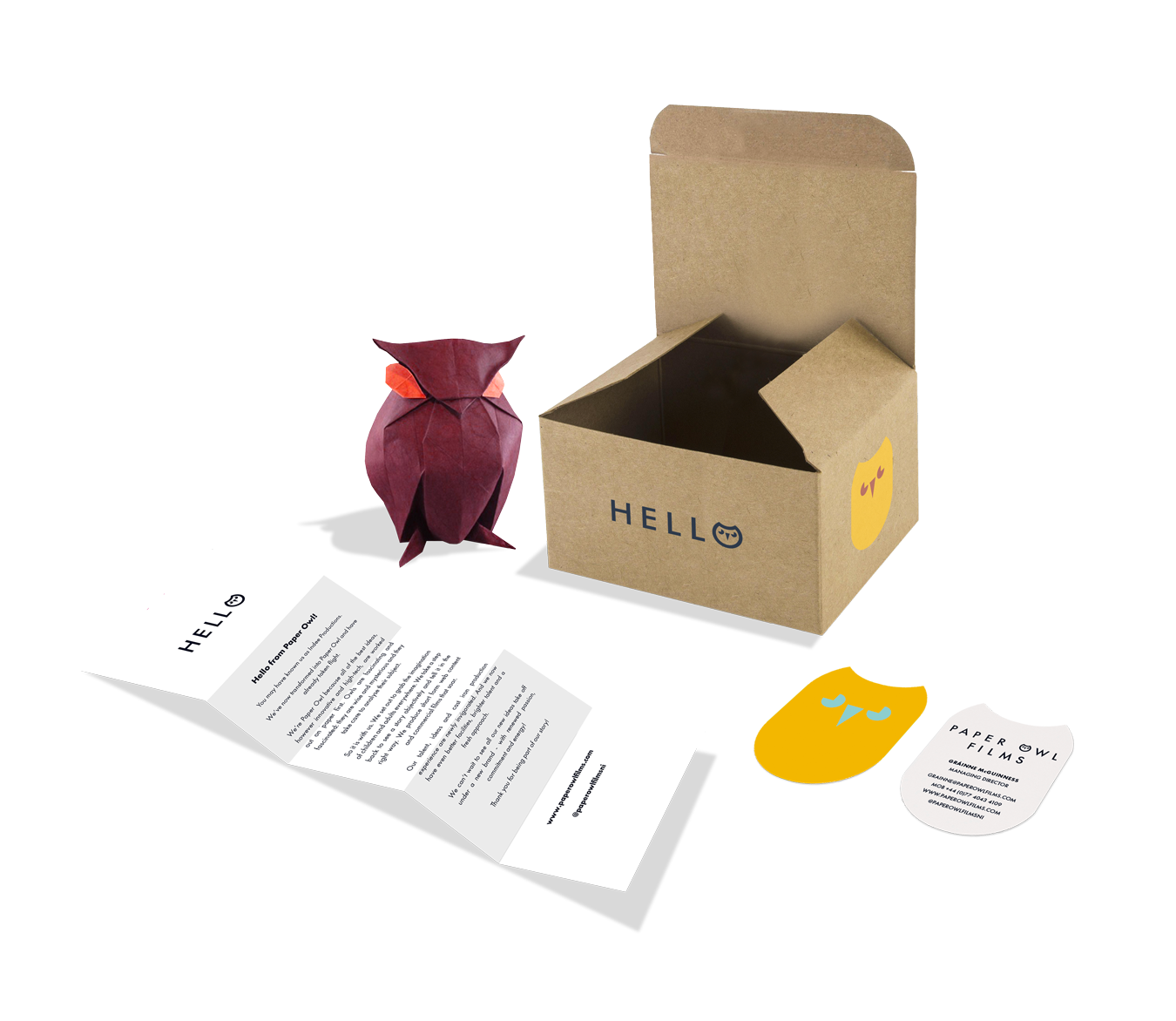
PAPER OWL FILM PRODUCTIONS LAUNCHED THEIR NEW CORPORATE ID .THE BESPOKE PACKS EACH CONTAINED A UNIQUE HANDMADE ORIGAMI OWL

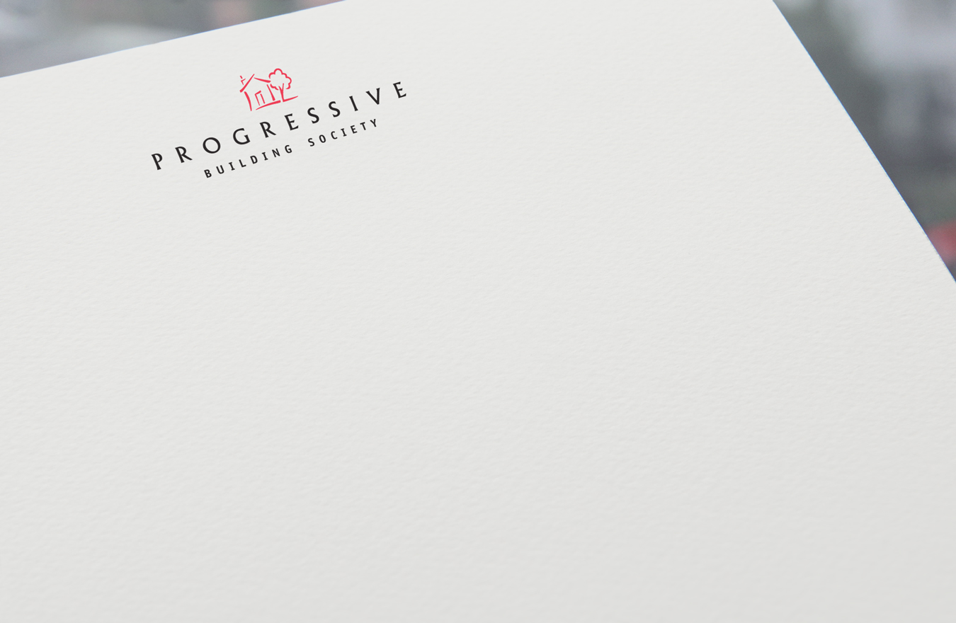
Designed in 1991 the Progressive House and Tree symbol has endured and continues to reassure savers and homeowners of the societies stability.
Alice through the looking glass was one of several themes lovingly crafted & created to help potray the the lengths and willingness the wedding venue would go to in order to meet expectations. The cakes were real and props took weeks to source
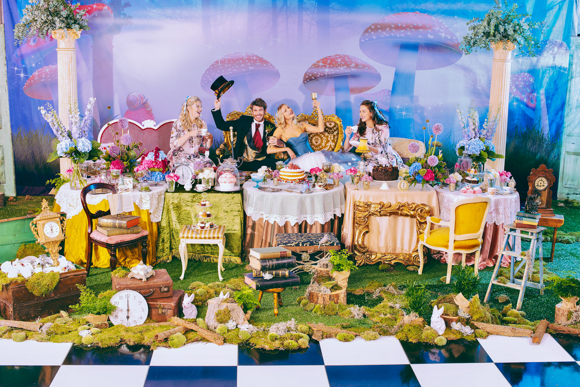
The Madhatter's Tea Party
This is one in a series of four themed wedding day shoots.
Belfast 89fm Radio
Corporate Identity refresh. Using the existing colours and fonts I set about trying to re - energise this rather dull corporate scheme. Everything about it looked cheap and uninteresting . By placing the stations name and frequency into a HEX shape it immediately felt more considered and ready for action. Never say the budget got in the way as in this case there wasn't one.